The Power of Great Product Photography

- Great product photography is good for sales and brand identity.
- It's best to have both simple catalog images on a white background as well as stylistic images.
- Powell Flutes launched a new highly reflective product, see the images.
Do you remember the Sears catalog? We tore it to shreds every year before Christmas. I think LL Bean was the only other catalog I remember seeing, much less ordering from. It was such a novelty to be able to see all the awesome things that could fill out my Christmas list, or even just check out things and wonder who would ever want that!
It's much different now. I'd guess many kids have never been to a mall. Any store visit is almost a novelty. The order-try-return cycle is a perfected technique. That's because there is still no substitute for holding something in your hand, trying it on, and getting to see it IRL.
Now we live in this world of immediate expectations, where anything is available at any time, only a Google search away.
But the other end of that Google search is whatever you see on an electronic screen. Nothing to touch or try on, and maybe not even a backside view!
This is where great product photography makes a difference.
You may see product photography as documentation of an item for sale, but that would be a missed opportunity. A little thought and effort put into the presentation of your product photos can pay dividends, not only in sales, but in the long game of brand recognition as well.
There are 2 kinds of product photos you find online (no, not good and bad although both do exist). 1.) There are the straight product photos. You see these on catalog sites like Amazon. An item floats on a plain, most often white background. There may even be multiple angles.
These are designed to replicate that "in your hand" experience. No distractions, just a product, and yes, it lacks realism, but these images serve a purpose. They are simple and say "here I am."
The 2nd type we'll call context images. These might be labeled lifestyle or artistic images. They place the product in a real world setting, interesting lighting, or a unique angle. They open up creative possibilities that allow a deeper connection, and can even add to the style and communication of a brand. The photo may stick to a certain color palette, or speak directly to a target audience.
I was contacted by Powell Flutes of Boston about a new product launch they had coming up. They wanted both the "no distraction on white" product photo as well as some artistic shots "worthy of hanging on the wall."
I was quite excited as this would be an intricate and creative project. I was able to visit the company site, and get a tour to see how the flutes are made. It was awesome! Powell Flutes is a 95 year old company with a lot of history and tradition, and I wanted to do my best to continue that tradition.
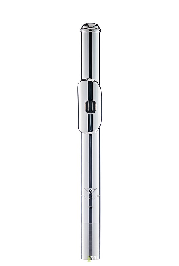
The product was a new head joint, which is the term for the mouth piece section of a flute. The only visibly distinguishing feature of this new piece is the 1927 etched below the Powell Flutes logo. Other than that, I have what is essentially a mirror in the shape of a tube, so I need to control the entire surroundings, because everything will be visible in the reflections.
The Powell Flutes brand style is clean, high contrast, and monochrome, so that's what I needed to match.
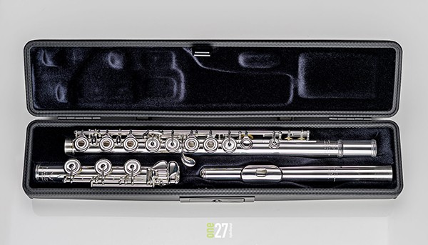
I was also asked to shoot a complete flute in its case for this project, so I'll show it here to put all the other images in context. The head joint is the piece on the right in the front of the case. I said monochrome, but all of the images are full color files.
Now on to the head joint images. First, the straight product on white.
Light is magical. Even though I placed no lights in front of the item, this image is the result from my complex setup of soft boxes and diffusion panels.
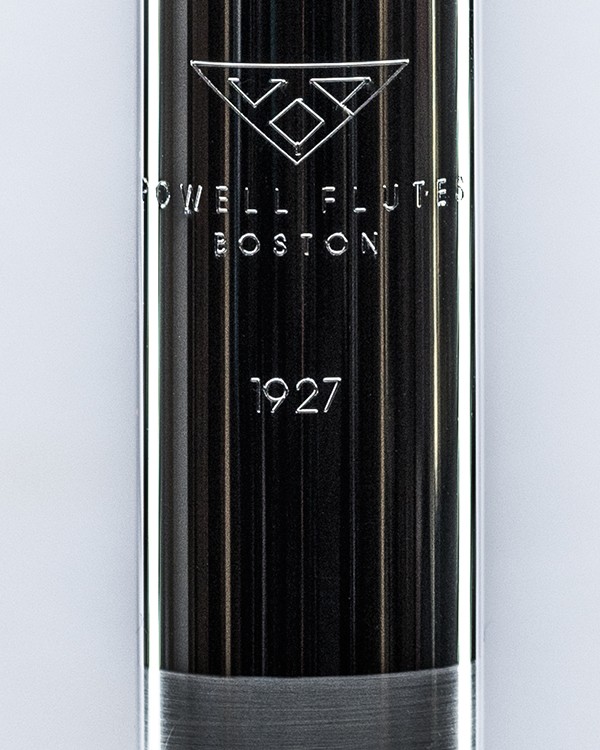
Here is a blow up of the etching section on the tube.
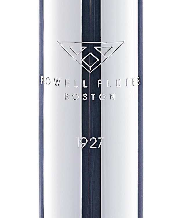
All the Powell Flutes have the logo etched in each piece, but this head joint has the unique 1927 etch beneath the logo. This mark, being the distinguishing feature, had to be the focus in any additional images I made of the product. The product materials and design are what make it new, but none of that is visible from a photograph.
So how many variations can be made, and are any of them interesting?
The tools at my disposal are angle of view, focus point, and lighting, which includes reflection. Below are some of the results.
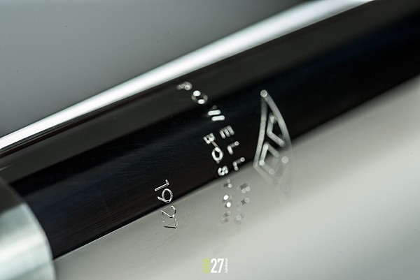
This is the only image image chosen on a dark background. It offers a different option to the high key mostly white images they have used in the past.
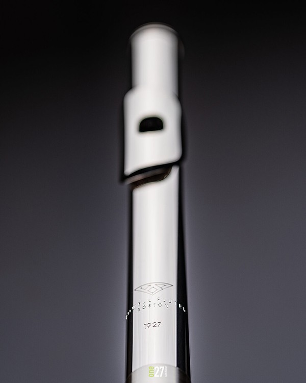
This image is a simpler lighting set up, with fewer diffusion panels, with the prominent reflection of the dark room beyond the setup. This image has the strongest version of he 1927 mark.
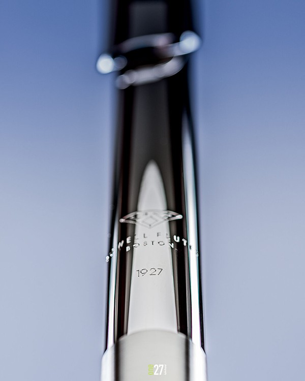
It's always a good idea to have options when it comes to image orientation. Graphic design on the web or in print often needs images both tall and wide.
Finally, this image was one of my favorites, as I like the fluid shapes between the light and dark areas. This one moves slightly outside the brand style, as the color adds a little punch to the image. I like to offer some alternative views to clients, as sometimes a new perspective can offer creative variation that may spark a new idea. These are always in addition to the required specs of the creative brief.
Given the narrow requirements of keeping the 1927 as the main focus, the client was happy with the process and the variety images created. An open ended directive is ultimately limited by the time allotted, but I was happy with the results as well. Do you have and comments or ideas? Share your thoughts in a comment below.
When you subscribe to the blog, we will send you an e-mail when there are new updates on the site so you wouldn't miss them.